Moonbean Coffee Roasters
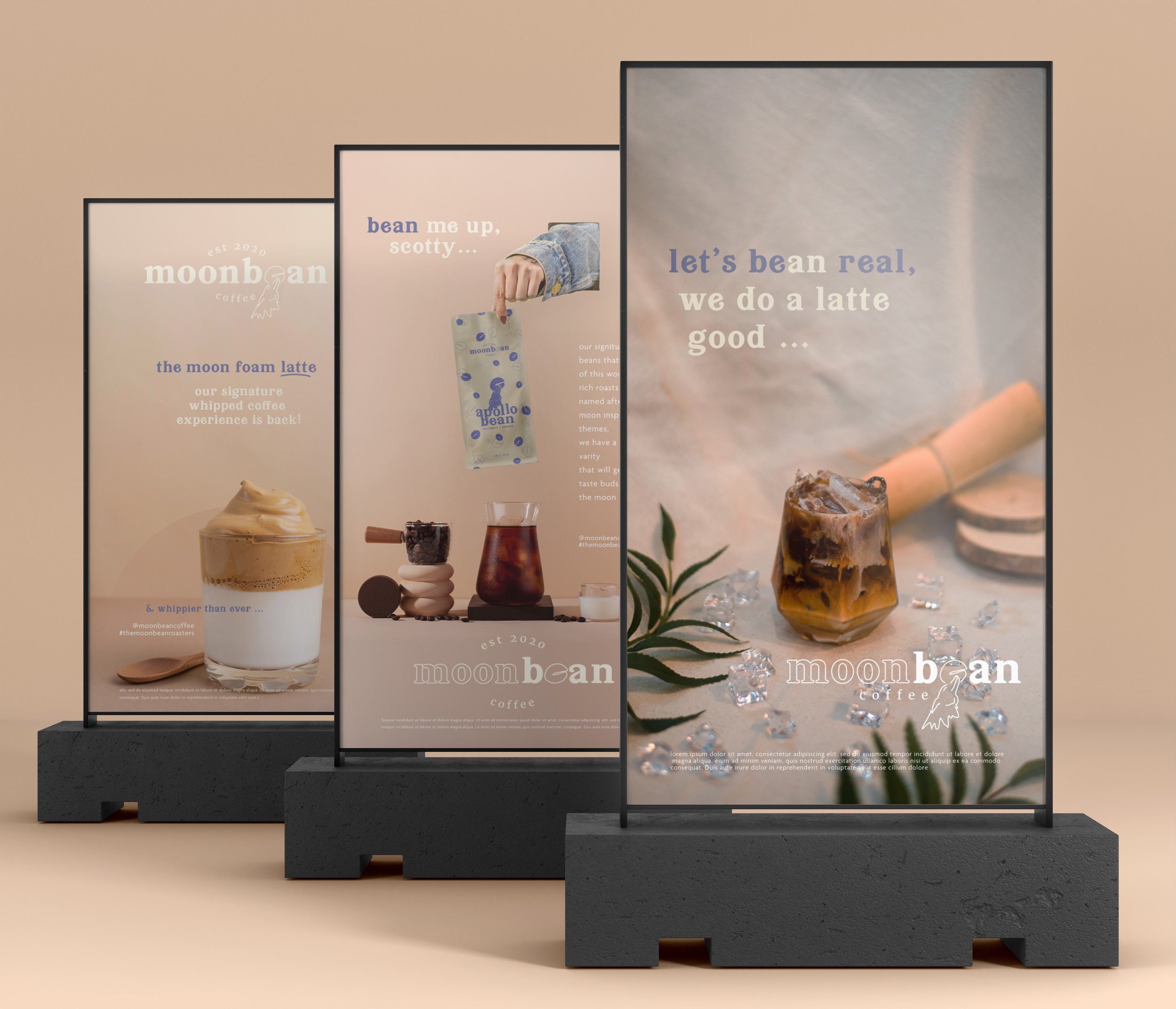
In this visual branding project, I created a concept organic company named Moonbean Coffee Roasters. Their roasts are out-of-this-world delicious and it will make your day brighter. Hence the name, Moonbean. A play on words that is echoed in their messaging style. The challenge was to create visual branding and messaging that resisted the average coffee shop atmosphere while still feeling relatable and nostalgic which draws creative young entrepreneurs in their 20s-30s.
Brand
Moonbean Coffee Roasters
Year
03 . 15 . 2022
Project
Visual identity, creative direction, logo design, and messaging
THE CHALLENGE
Executing visuals that communicated a high coffee experience but maintained a youthful and fun atmosphere - speaking to Millennials and Gen-Z alike.


THE SOLUTION
Created visual branding by combining illustration, playful brand voicing, and color palette that conceptualize an elevated experience while still warm, youthful, and inviting.
I conceptualized and designed a line of packaging for their beans. While cohesive, each roast has it’s own color combination and custom roast name that is related to the moon theme of the brand, such as the Guatemalan roast “Apollo bean” and the Ethiopian “Luna bean”.
THE VOICE
I designed a friendly, punny and authentic voice that speaks to creative entrepreneurs in their 20’s-30’s. Creatives thrive in authentic accommodating atmospheres, and Gen-Z values collaboration and inclusivity.
By communicating a brand voice that is familiar and doesn’t take itself too seriously - it extends an inviting and accepting tone that makes the audience feel at home and free to be themselves.
EXAMPLE:
“A product so good it's out of this world, we know you’ll feel a familiar warmth that carries nostalgia while enjoying a Moonbean brew. Sip and see, that this bean does a latte good.”
-
A coffee roaster brand dedicated to the quality of their beans and an elevated customer experience. They take the craft coffee experience and make it accessible to everyone.
Their brand creates a high coffee experience while maintaining a youthful, collaborative and fun atmosphere that speaks to Millennials and Gen-Z alike.
Their aesthetic is elegant with a twist of funk. High-end yet cozy. Their product is elevated yet affordable.
-
They draw young adults in their 20’s-30’s who appreciate a fun, artistic atmosphere and an excellent brew.
Their audience likes community, networking, and the arts. Therefore, a comfortable, visually appealing space and affordability are highly valued.
They can tend to be creatives who love collaborating, so the space needs to feel visually appealing while high-end and cozy. Not pretentious, but emulating an authentic culture.
-
Elevated
Playful
Warm
Authentic
youthful
accessible
CONCLUSION
I designed an elegant branding aesthetic with a twist of funk that appeals to the audience, creatives into their 20’s - 30’s. The brand voice is friendly, inviting, and punny, communicating an authentic and relaxed atmosphere. Solving the brands challenge of reaching their desired audience and asthetic.


